
Optivity
Strategy in Motion
Branding Beyond the Storefront
TYPE
Branding | Packaging | Print
CLIENT
BCIT, Graphic Design Course
TIMELINE
April–June 2025
TYPE
Branding | Packaging |Print
CLIENT
BCIT, Graphic Design Course
TIMELINE
Challenge
To create a unique brand for an eyewear store that is rooted in the vibrant and historical community of East Village.
THE BRAND
Optivity is an eyewear store that aims to inspire movement with a clear vision. It provides a curated eyewear selection to help people find the perfect solution for any outdoor venture.
Beyond developing a visual identity, this project was about differentiation and defining what makes a brand truly distinct.
The community doesn’t need just another neighborhood eyewear store, it needs a brand that connects to people’s goals and aspirations. By identifying that niche and building a visual identity around it, the brand becomes more than a storefront; it becomes a reflection of the people and community it serves.
Type
Branding
Packaging
Client
BCIT, Graphic Design Course
Timeline
April–June 2025

The Brand
Optivity is an eyewear store that aims to inspire movement with a clear vision. It provides a curated eyewear selection to help people find the perfect solution for any outdoor venture.
Type
Branding
Packaging
Client
BCIT, Graphic Design Course
Timeline
April–June 2025
About the Neighbourhood
Where heritage character meets outdoor living
East Village is located in the beautiful city of Vancouver, Canada, bordering open waters of the Burrard inlet and Burnaby. There's easy access to nearby North Shore Mountains, and it's home to the Pacific National Exhibition with decades of history and local tradition. It's known to have many large outdoor recreational areas including 13 parks, 7 playgrounds, and 2 dog parks.
The store is located in the heart of it all on Hastings Street. Lined with unique shops, quirky cafes, family-run businesses, and scrumptious restaurants, this stretch of businesses are passionately connected with the locals who live in the neighbourhood.
13
Parks
7
Playgrounds
2
Dog Parks

About the Neighbourhood
Where heritage character meets outdoor living
East Village is located in the beautiful city of Vancouver, Canada, bordering open waters of the Burrard inlet and Burnaby. There's easy access to nearby North Shore Mountains, and it's home to the Pacific National Exhibition with decades of history and local tradition. It's known to have many large outdoor recreational areas.
The store is located in the heart of it all on Hastings Street. Lined with unique shops, quirky cafes, and family-run businesses, this stretch of businesses are passionately connected with the locals who live in the neighbourhood.
13
Parks
7
Playgrounds
2
Dog Parks

ABOUT THE NEIGHBOURHOOD
Where heritage character meets outdoor living
East Village is located in the beautiful city of Vancouver, Canada, bordering open waters of the Burrard inlet and Burnaby. There's easy access to nearby North Shore Mountains, and it's home to the Pacific National Exhibition with decades of history and local tradition. It's known to have many large outdoor recreational areas.
The store is located in the heart of it all on Hastings Street. Lined with unique shops, quirky cafes, family-run businesses, and scrumptious restaurants, this stretch of businesses are passionately connected with the locals who live in the neighbourhood.
13
Parks
7
Playgrounds
2
Dog Parks
UNDERSTANDING THE LANDSCAPE
3 Neighbouring Parallel Businesses
This section of Hastings Street is already home to three established optical shops, which raised several important questions:
-
What positioning does each of these businesses claim?
-
What do they take pride in and communicate as their core strengths?
-
How do they express themselves visually—their branding, storefronts, and overall identity?
-
How can a new eyewear brand stand out with its own unique selling point?

Eye Contacts
-
30 years of experience
-
High quality eye care for the entire family and exceptional customer service.
Understanding the Landscape
3 Neighbouring Parallel Businesses
This section of Hastings Street is already home to three established optical shops, which raised several important questions:
01. What positioning does each of these businesses claim?
02. What do they take pride in and communicate as their core strengths?
03. How do they express themselves visually—their branding, storefronts, and overall identity?
04. And most importantly, how can a new eyewear brand stand out with its own unique selling point?


Brand Concept
Inspiring movement with a clear vision—
Providing eyewear for everyone in the community who enjoys movement, recreationally or professionally.
Brand Concept
Inspiring movement with a clear vision
Unique Selling Proposition
The USP of the brand lies in the area and the people it serves—providing eyewear for everyone in the community who enjoys movement, recreationally or professionally.
Brand Name
Optivity combines the words “optometry” and “activity” which together form the foundation of the brand.
Tagline: See Beyond Your Limits
This tagline conveys that the brand’s products and services go beyond just helping the target audience to see clearly, but they also help unlock people’s innate potential and ability to move more and perform better.
Brand Concept
Inspiring movement with a clear vision
Unique Selling Proposition
The USP of the brand lies in the area and the people it serves—providing eyewear for everyone in the community who enjoys movement, recreationally or professionally.
Logo Design
Exploring Symbols to Define Motion
Mind map: This process helped generate an array of keywords, which were then translated into potential shapes, themes, and symbols to explore in the thumbnail sketch stage. Among the ideas, the motif of sun rays stood out because it reflected the brand's connection to the outdoors.
Thumbnails: The goal was to explore circular forms that conveyed a sense of movement, deliberately moving away from the static glasses or eye motifs commonly used by competitors.
As the sketches evolved, the idea of radial streaks—reminiscent of both the human pupil and sun rays—began to take shape. Eventually, these elements merged with an infinity symbol, creating a mark that suggests continuous motion.


.jpg)


Colour
Mirroring the passion and energy in sportwear
The brand’s colour palette draws inspiration from the vibrant sportswear and eyewear that are commonly worn outdoors.
Shades of orange and red were chosen to evoke energy, passion, and optimism for movement, while also setting Optivity apart from competitors who largely rely on greens and blues. Turquoise, blending blue and green, introduces a sense of clarity and transformation to the palette.


Typography
Form & Movement
Clean. Geometric.
Friendly curved forms to convey fluidity and continuity.
The logo is italicized to convey movement.

Shaping Optivity's Brand Identity
The complete visual identity includes:
-
Logo usage
-
Typography system
-
Brand colour palette
-
Image guideline and photography tone
-
Patterns


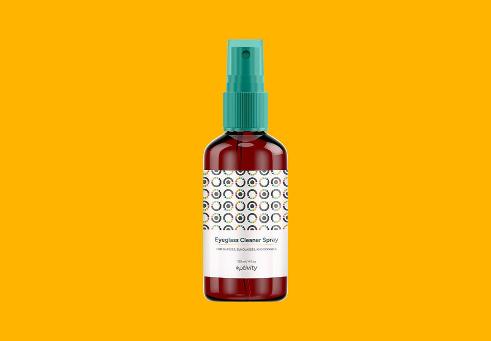
Brand in Action
I applied the visual identity across multiple touchpoints to create a cohesive brand experience. One example is a promotional kit, which features a custom thank-you box designed to hold an eyewear case, lens cleaner spray, business card, and referral or discount card. This enhances the post-purchase experience and strengthens brand loyalty.


Key Takeaways
01
A clear USP drives clarity.
Defining a clear unique selling proposition—eyewear for people who enjoy movement made it easier to shape the brand story, brand name, logo, and overall brand identity. When the positioning is clear, creative decisions become more focused and intentional and the brand is able to stand out amongst its competitors.
02
Differentiation requires strategy.
Analyzing competitors’ positioning and visual identities helped shape my design direction. By recognizing common visual patterns in the industry, I was able to avoid frequently used shapes and colour palettes such as literal eyes or glasses icons. Instead, it pushed me to think more innovatively. It encouraged a more intentional exploration of symbolism, drawing inspiration from nature and movement to represent the brand in a way that feels distinctive and conceptually aligned.
03
Shaping Meaningful Brand Touchpoints
I used a customer journey map to guide the development of brand touchpoints. By considering the moment of interaction, customer thoughts, and actions, it helped me design touchpoints that are relevant and valuable to the target audience.
With gratitude
I'm grateful that this project pushed me to see beyond my limits
With gratitude
I'm grateful that this project pushed me to see beyond my limits.
I'm grateful that this project pushed me to see beyond my limits.
