
IKEA
Weaving a Narrative
TYPE
Annual Report | Ad Campaign | Layout Design
CLIENT
BCIT, Graphic Design Course
TIMELINE
April–June 2025
TYPE
Annual Report | Ad Campaign | Layout Design
CLIENT
Burnaby Fire Department
TIMELINE
April–June 2025
Challenge:
To design an annual report and ad campaign using a consistent narrative.
This project explores how a single narrative can be woven throughout an annual report and an advertising campaign to guide both message and design. Thoughtful storytelling can guide design decisions, create cohesion across touchpoints, and foster a deeper emotional connection between a brand, its values, and the people it hopes to reach.

ABOUT
Creating a better everyday life for the many people
IKEA is a leading global home furnishings retailer founded in Sweden. Operating over 500 stores in more than 60 countries, it provides functional, durable, and affordable home furnishing solutions.

THE BRAND AUDIT
Uncovering the stories behind the familiar
A brand audit revealed more than just typography, colour palettes, and brand guidelines. It uncovered a vision that deeply resonated with me and it became the story I wanted to tell through this project.

WHAT EVERYONE KNOWS
The Surface
While many know IKEA for its affordable and functional home furnishings, not many are aware of the company’s broader efforts to create positive social impact.
WHAT TO REVEAL
Digging Deeper
Numerous initiatives exist to support refugees, advocate for the LGBTQ+ community, and build partnerships with suppliers that help improve living and working conditions in developing countries.
THE KEY MESSAGE
Supporting communities in creating a better everyday life for people around the world
Of all of IKEA's social initiatives, I chose to focus on programs that highlight ethical sourcing and local craftsmanship that made an impact on communities. By highlighting the stories behind the products, the campaign humanizes communication materials. It emphasizes the “why,” showing why supporting IKEA matters and how the company is realizing its vision.

Concept Development


CONCEPT REFINEMENT
Weaving a better future
The concepts of puzzle pieces and gallery wall seem predictable, so the concept of weaving was chosen for its handmade nature and the theme of individual threads being woven together to increase the integrity of the final product. Not only is the messaging clear, but there are also lots of graphical ways to represent weaving.

IKEA Annual Report

Stories That Show Impact, Not Just Numbers
Yes, annual reports' goal is to communicate its performance over the past year to key stakeholders. They often rely heavily on numbers—financial summaries, growth metrics, and statistics, which can feel impersonal. But true impact comes from the human experiences behind the data.
There is no better way to show impact than by highlighting the moments that bring the company’s values to life.
Collecting stories
Weaving a narrative
I started gathering content for the annual report that could weave a story of collective effort and impact. Including voices from stakeholders and communities was essential. Their quotes would bring authenticity to the report, reinforce the message, and create an emotional connection with the readers. I asked myself:
What stories are the most impactful?
What stories evoke the strongest emotions?
How have IKEA’s collaborations improved livelihoods for marginalized communities? What collections or products showcase this impact?
Final Report

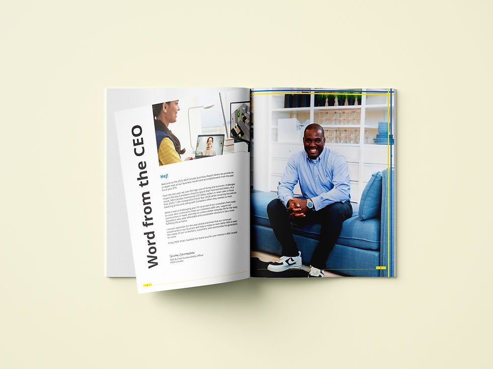


Designing with a woven narrative
From a visual perspective, the concept of weaving is integrated by overlaying strips of colour, lines, and rectangles to echo the structure of woven threads. These graphic elements are paired with imagery of local craftsmanship and community to reinforce the narrative behind the work.
Ad Campaign
Carrying the thread forward
With the ad campaign, the focus shifts to IKEA's retail products. The keyword is discovery—helping customers to discover IKEA's handmade collections that have a large social impact.
Applying the same motif of weaving, I designed brand touchpoints such as posters for bus stops and transit stations as well as gift cards and shopping lists.
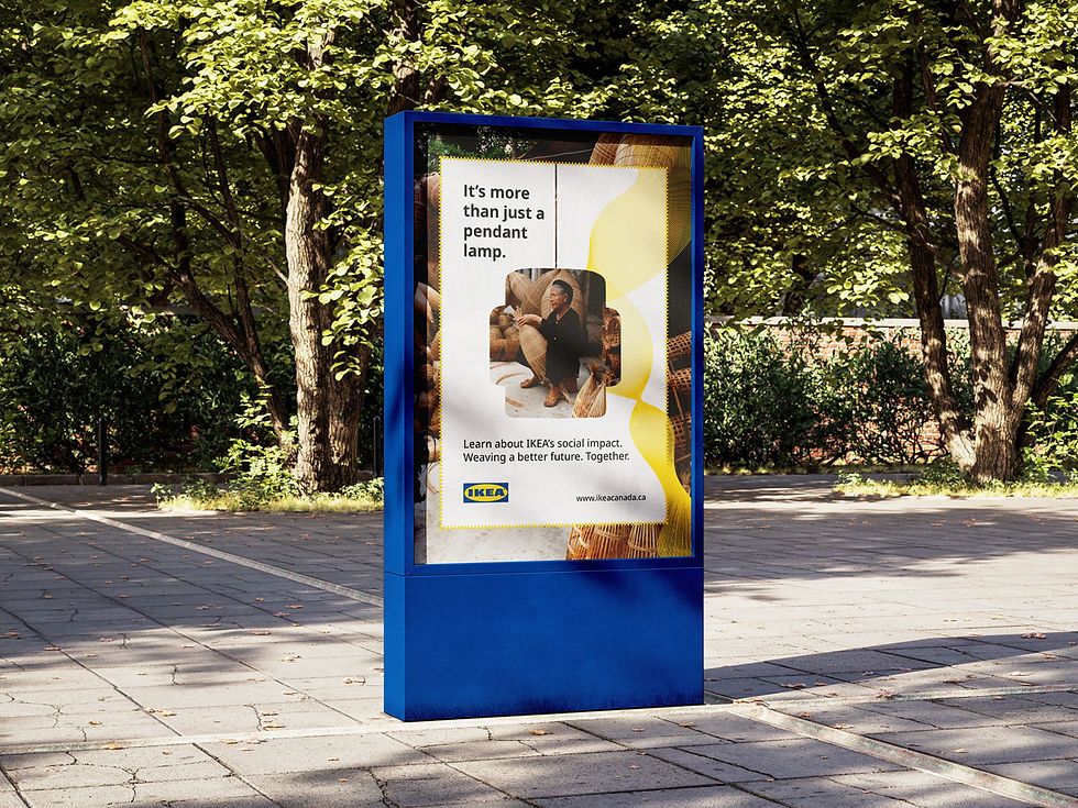

The posters are designed to stand alone or be displayed together, allowing the weaving pattern to continue and connect across the series.


The weaving pattern is carried through to the gift card as well.
IKEA’s audience includes both young adults and children, so the shopping list with the colouring activity on the back was designed to engage the whole family.
Parents can use it during their visit to plan and track items, while children can colour in a piece of IKEA product just for fun. They can also submit their drawings to IKEA’s suggestion box, where the ideas could inspire future patterns and products developed in partnership with social entrepreneurs. This interactive format encourages a playful connection between customers and IKEA’s products.
Each handmade product is paired with a QR code that customers can scan to discover more about the brand’s partnerships with social entrepreneurs and the communities behind the products.


Key Takeaways
01
Impact isn’t just numbers, using consistent messaging in both content and design can humanize data and build a sense of narrative.
By weaving together a central theme and community stories, the annual report and marketing materials become more human and relatable. Impact isn’t just numbers. When messaging and visuals consistently support one another, data becomes a narrative that increases engagement and sales.
02
Maintaining consistency
The biggest challenge was ensuring the weaving message was reflected across every touchpoint. Every design decision also had to align with the brand’s voice, visual style, and guidelines.
03
Knowing what works and what doesn't
Time was dedicated to study IKEA’s brand guidelines and apply its typography, color palette, and photography style consistently. It was essential to work within these parameters while still creating engaging designs and to understand when to exclude elements that do not fit into the branding.

Thank you to IKEA for inspiring me to explore a meaningful narrative.
Acknowledgement: The photos used in the annual report are the property of IKEA and are used for personal purposes only.
.jpg)
CAMPAIGN NAME
EXPERIENCED RESULTS
DRIVEN LEADERSHIP
2035