
Kommunity
Learning to Pivot
TYPE
Branding | Research | Web Design
CLIENT
BCIT, Graphic Design Course
TIMELINE
Sept–Dec 2025
TYPE
Branding | Research | Web Design
CLIENT
BCIT, Graphic Design Course
TIMELINE
Sept–Dec 2025

Challenge
To create a visual identity and business strategy for an online e-learning platform.
Challenge
To create branding and business strategy for an online e-learning platform.

Knowledge Sharing Platform

Problem Statement
Many people use online resources to learn new hobbies or skills, but paid courses can be expensive. Free options like YouTube lack interactivity, such as the opportunity to ask questions or receive real-time feedback.
Solution Statement
An interactive and free e-learning platform for live knowledge exchange to build meaningful connections in the community. Users can share their knowledge on the platform in exchange for tokens they can use to take classes from other users.
Provisional Personas
Who are the users?
The personas represent people who are looking to pursue a hobby or develop a skill, but are considerate of their spending. They also want to connect with others and find a sense of belonging.


Research Process
01
Primary Research
Conducted interviews with 8 potential end users based on provisional personas
02
Key Insights
Evaluated assumptions against processed findings which included user needs, challenges, and behaviours
03
Customer Profile
Created a detail profile with pains, gains, and jobs
04
Priority Chart
Developed a chart the prioritizes the identified pains, gains, and jobs for target users

Key Insights
What the users are saying
Users predominantly use Youtube to search for instructional videos, but the search process can be lengthy if they can't find what they are looking for.
Users struggle with overlapping beginner content, missing information, and lack of exploration into certain subtopics. They want vidoes to be more catered to their needs.
They want to interact with instructors in order to ask questions, elaborate on topics of interest, and receive feedback.
PRIMARY Research
Customer Profile
Based on user feedback, the top priorities are:
-
Affordable, interactive videos
-
Personalized content
-
Improved matching and tailored class recommendations


Competitor Research
What's out there?
1
Direct competitor
8
Indirect competitors
Gaps and opportunities:
-
Prioritize live sessions with segments of real-time interaction, feedback, and Q&A
-
Develop community forums to encourage ongoing engagement and peer support
-
Add input fields for each session and matching processes to better tailor courses to individual user needs

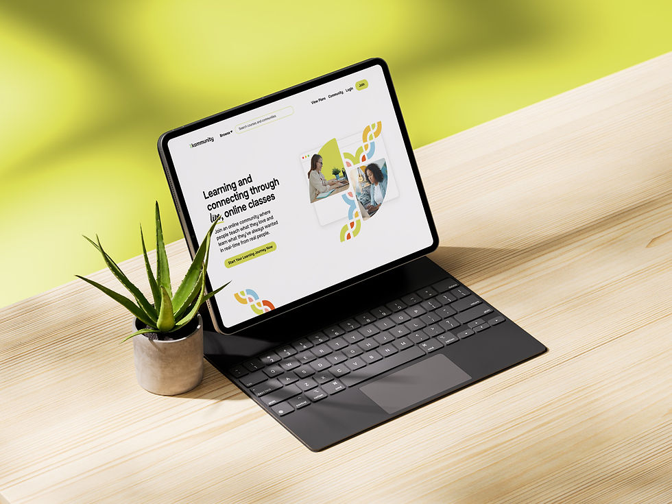
Kommunity
K + community = Kommunity
Learn, share, and grow—together.
Vision
To create communities of shared learning
Values
-
Community: We create supportive environments of curiosity and collaboration.
-
Inclusion: We make learning accessible for everyone.
-
Trust/Transparency: We nurture a culture of respect and openness through open dialogue and honest feedback, ensuring every learning exchange is genuine and meaningful.
BRAINSTORMING
Brand Archetype & Moodboard
The Everyman archetype was chosen because its key personality traits and brand voice of belonging, connection, friendliness echo that of the platform’s vision and values.
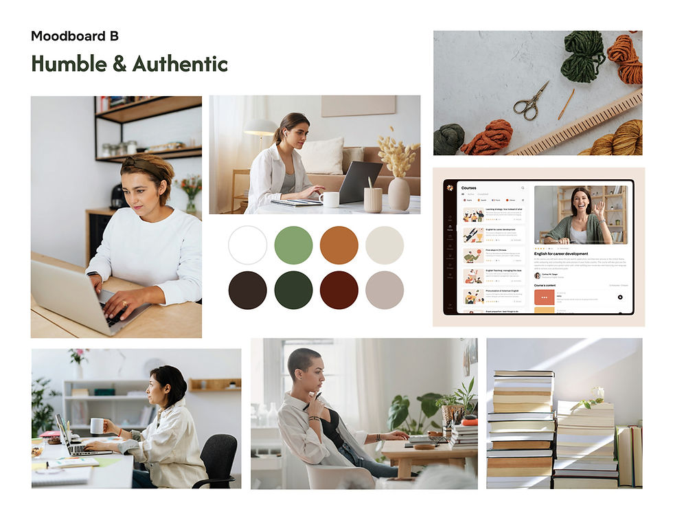
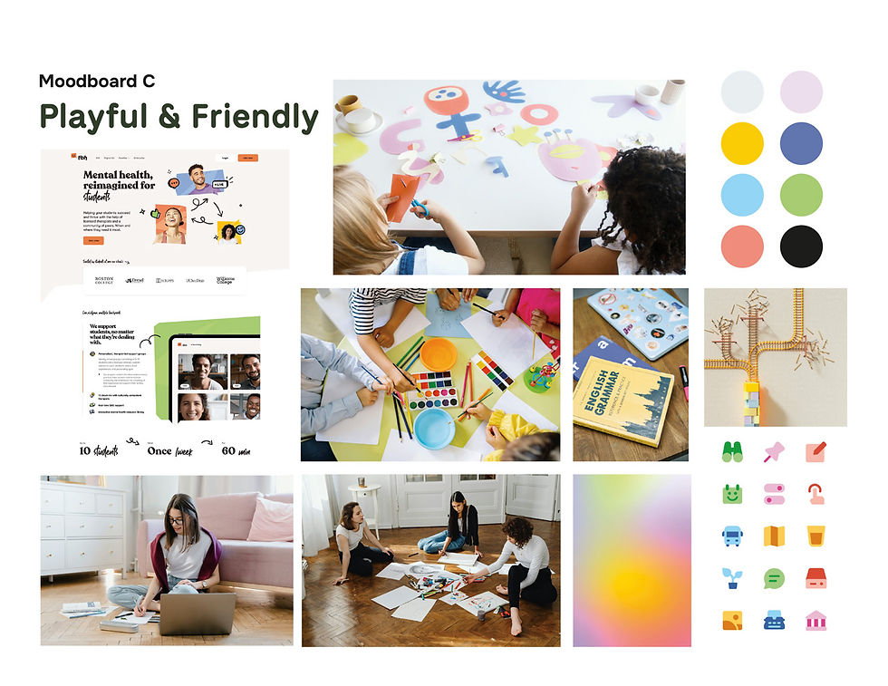
Moodboard A’s use of blue and purple feels cold rather than inviting. Many competitors also use blue and purple as their primary colour so it would be ideal to differentiate from them. Instead, Moodboard C feels the most friendly with the use of pastel colours against a light for dark background.

Logo Design
Exploring Symbols to Define Learning
Thumbnails: I explored incorporating the silhouette of a book and play button with the letter "k" to represent knowledge and e-learning.
As the sketches evolved, I kept the idea of the book silhouette but incorporated rounded forms to convey a friendly and approachable tone.


Colour Palette
For the primary colours, a lime green was chosen to be used in conjunction with a sky blue to symbolize growth, harmony, and reliability.
Many competitors already use dark saturated blues and purples as their primary colour so a light green and blue were chosen to offer a point of differentiation in addition to conveying inclusion and approachability.


Key Takeaways
01
The Pivot
Sometimes the best solutions come from unexpected pivots. I initially proposed a tool-sharing app where users could lend and borrow equipment within a community. However, research revealed a mismatch between what users want to borrow and what they’re willing to lend, limiting the app’s usefulness.
These insights led me to rethink the concept—not as a setback, but as redirection toward a stronger, more cohesive value proposition.
03
Branding goes beyond the logo.
This project was the first time that I used a customer journey map to guide the development of brand touchpoints. By considering the moment of interaction, customer thoughts, and actions, it helped me design touchpoints that are relevant and valuable to the target audience.
02
Differentiation requires strategy.
Analyzing competitors’ positioning and visual identities helped shape my design direction. By recognizing common visual patterns in the industry, I was able to avoid frequently used shapes and colour palettes such as literal eyes or glasses icons. Instead, it pushed me to think more innovatively. It encouraged a more intentional exploration of symbolism, drawing inspiration from nature and movement to represent the brand in a way that feels distinctive and conceptually aligned.
.jpg)
CAMPAIGN NAME
EXPERIENCED RESULTS
DRIVEN LEADERSHIP
2035