
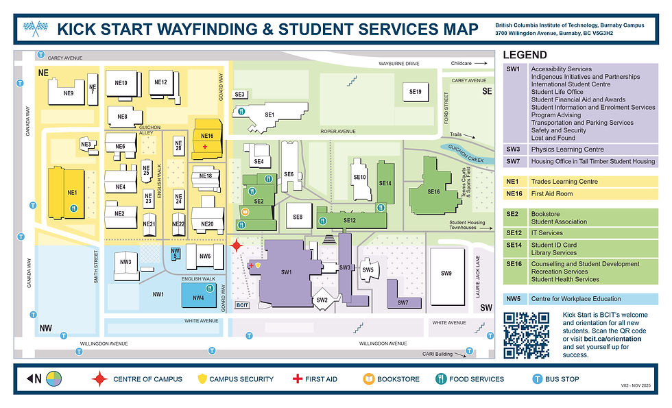
BCIT Burnaby Map Update
Navigating Purpose and Context
BCIT Burnaby Map Update
Navigating Purpose and Context
TYPE
Illustration | Layout Design | Print
CLIENT
BCIT Student Life Office
TIMELINE
Oct 2024–Feb 2025
TYPE
Illustration | Layout Design | Print
CLIENT
BCIT Student Life Office
TIMELINE
Oct 2024–Feb 2025
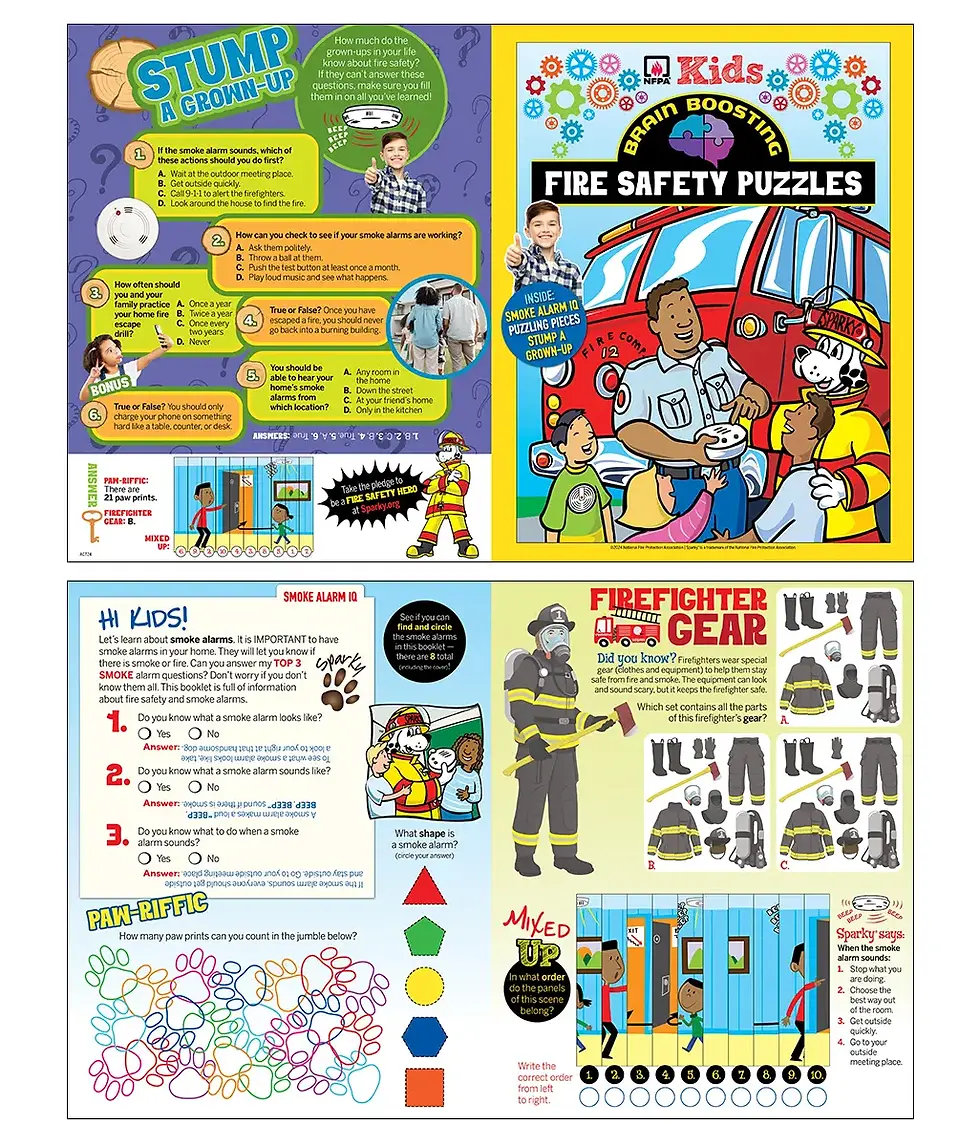
Fire Safety Booklet
Eight Voices, One Vision
TYPE
Layout Design
CLIENT
BCIT Student Life Office
TIMELINE
Oct 2024–Feb 2025

Challenge:
Update BCIT’s Burnaby campus map to improve navigation and make student services and supports easier to find and understand.

About BCIT
"Different than a college or university, the British Columbia Institute of Technology offers practical, flexible, applied education with instructors who have direct, hands-on experience in their field."
Burnaby Campus
The Burnaby campus is the largest BCIT campus, home to hundreds of specialized learning spaces.
Student Services Map
What is it?
A campus map that helps students navigate the Burnaby campus while highlighting key student services
Usage
They’re distributed during campus tours, on the first day of classes, and offered as a free resource for students.
Target Audience
Full-time, part-time, and prospective BCIT students


THE PREVIOUS VERSION
Understanding the Gap
Annotations obscured building numbers.
Newly constructed buildings were not included.
Back section is outdated, with scattered references to other campuses.
THE PREVIOUS VERSION
Understanding the Gap
Annotations obscured building numbers
Missing new buildings that have been built
Information in the back are outdated with a scattered focus
GOAL
How to Move Forward
The priority is to highlight student services and avoid duplication with existing maps that already cover accessibility, parking, and dining options. The goal is to improve wayfinding through a clear legend and a four-quadrant layout (NW, NE, SW, SE).
Brainstorming
This is a paragraph area where you can include any information you’d like. It’s an opportunity to tell a story about the business or describe a special service or product it offers. You can use this space to share the company history or highlight a particular feature that sets it apart from competitors.
Let the writing speak for itself. Keep a consistent tone and voice throughout the website to stay true to the brand image and give visitors a taste of the company’s values and personality.

Service Name
This is a paragraph area where you can include any information you’d like. It’s an opportunity to tell a story about the business or describe a special service or product it offers. You can use this space to share the company history or highlight a particular feature that sets it apart from competitors.
Let the writing speak for itself. Keep a consistent tone and voice throughout the website to stay true to the brand image and give visitors a taste of the company’s values and personality.

Connect the Dots
Supports the following developmental skills while subtly introducing fire safety concepts.
-
Number sequencing
-
Fine motor skills
-
Hand-eye coordination
Find and Colour Objects
Builds observation and awareness
-
Fire safety is largely about noticing your environment.
-
This activity trains children to identify important safety items and potential dangers
Identify Objects and Label
Reinforces recognition of key safety elements and reinforces early reading and spelling skills
SECONDARY RESEARCH
What's already out there?
Several BCIT maps exist
Supports the following developmental skills while subtly introducing fire safety concepts.
-
Number sequencing
-
Fine motor skills
-
Hand-eye coordination
-
-
Builds observation and awareness
-
Fire safety is largely about noticing your environment
-
This activity trains children to identify important safety items and potential dangers
-
-
Reinforces recognition of key safety elements
-
Reinforces early reading and spelling skills
-

01
Icons
Instead of relying on individual icons for each student service—which can quickly become outdated—a streamlined set of icons was used to represent the four quadrants of the map.

02
Colours & Accessibility
These four colours paired with black pass the Web Content Accessibility Guidelines (WCAG) AA standards for colour contrast.


Key Takeaways
Narrowing the Scope
Understanding that the map’s primary purpose is wayfinding and sharing student resources, it wasn’t helpful to pack the map with excessive information that can be better illustrated by another map. Too much information can overwhelm users and distract from the key points. This project taught me that focus often creates a stronger, more effective design than simply including more content.
Action-Oriented Design
The moment of interaction is short, so how can users maximize the information they retain from the map? Including a clear call to action is essential. A QR code is commonly used and directly sends users to websites where they can find more information and take the next step.

Key Takeaways
Key Takeaways
Narrowing the Scope
Understanding that the map’s primary purpose is wayfinding and sharing student resources, it wasn’t helpful to pack the map with excessive information that can be better illustrated by another map. Too much information can overwhelm users and distract from the key points. This project taught me that focus often creates a stronger, more effective design than simply including more content.
Lasting Designs
Frequently updating and reprinting communication materials is inefficient; using timeless icons provides a more sustainable solution. Using QR codes further enhances usability by directing users to up-to-date information online, allowing them to easily access details and take the next step.
Key Takeaways
01
Designing with budget constraints
Budget restraints do directly influence design decision. Choices around colour usage, paper size, paper count, and paper weight all affect printing costs. Early communication with the client and the print shop makes the process smoother and more aligned.
02
Designing for young learners
It’s all in the details. Although we didn’t conduct formal primary research on the target audience, we had connections to elementary school teachers who were able to offer insight on how K to grade 3 students best learn. I was intentional about line weight, spacing, and illustration detail—ensuring there was enough room for coloring, writing, and drawing. Overly intricate activities and graphics were avoided to better support young learners’ learning. The decisions were informed by what letterforms the target audience can identify the most clearly, for example using single counter a instead of two. What's the stroke width that would leave enough space for students to colour in?
03
Prototyping for Clarity
Seeing a physical product on a screen isn’t always conducive to knowing how it will actually look like when printed. When I was working on my pages, I printed physical copies to gauge legibility of text, evaluate the grid size, and confirm whether there was enough space for students to fill out information and draw comfortability. Usability based on target audience needs was a top priority.
04
Collaboration & Cohesion
Working with seven other designers presented the challenge of delivering a booklet with a cohesive look. To address this, we aligned early on content direction and style prior to illustration, held multiple discussions, and shared design assets such as mascots and icons. Clear communication and structured collaboration ensured the final booklet felt cohesive rather than being designed by eight different designers.
05
Diversity and inclusion
Inclusion and diversity are important in a children’s fire safety booklet because they help ensure that all children can see themselves represented and understand the information being shared. When illustrations and examples reflect different cultures, abilities, family structures, and communities, children are more likely to feel included and engaged with the material.
